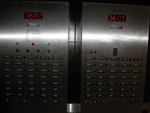
Believe it or not, I don’t really have anything negative to say about this elevator panel, just that it’s rather overwhelming the first time you see it. But I’ve seen it many times, so it no longer phases me. There are two panels because the elevator has two doors, one on each side — there are two apartments on each floor and the elevator opens directly into each apartment’s foyer — so while there are a hell of a lot of buttons, they’re actually mapped to the real world (always a good thing).
First you swipe your fob over the black box at the top of the right panel to “unlock” your apartment and then you press your button. The Lobby (L button) is always unlocked, as are the SPA and USPA buttons (USPA stands for Upper Spa), all on the left panel. In the other elevator, the panels are flipped.
Can you think of a better way for these buttons to be laid out? Post your sketches here!
Related Posts:
- Photo of the day: Hebrew elevator February 23, 2009 | 13 comments
- Photo of the day: Elevator button or fire alert? April 1, 2009 | 5 comments
- Photo of the day: Negative Floors October 19, 2011 | 28 comments
- Photo of the day: Private Parts in Public July 7, 2009 | 10 comments
- Photo of the day: LLUP to open January 26, 2010 | 0 comments


You really should have titled this “Elevator Action“
Why have buttons at all? Swipe your fob and go!
So this is all very interesting for a person that lives in the building and that can use the fob to unlock the elevator. What happens if someone is visiting us? Do they have to take the stairs?
________
Mathew Farney – Web Hosting
I also thought immediately why not just use the fob and go. And for friends why not just list of residents and a elevator phone with a ok to come up button in the appartment
These residents want their privacy so no list is posted