There was outrageous and incredibly frightening turbulence on my Cathay Pacific flight back to JFK from Vancouver. When it was all over, my heart was pounding and I was just happy to be alive. I decided to turn on a movie to calm myself down even though there was less than two hours left in the flight.
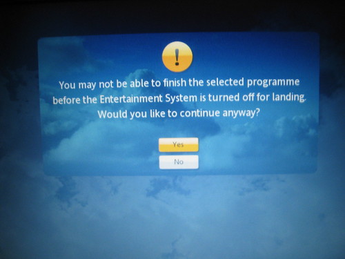
When I chose a movie that was 105 minutes long, I got this lovely warning:
You may not be able to finish the selected programme before the Entertainment System is turned off for landing. Would you like to continue anyway?
Yes/No
There are many systems that would just play the movie and cut you off at the end with no warning. I loved that it did the math for me ahead of time and let me know what to expect, but also that I could play the movie anyway. I had chosen a movie I’d seen many, many times before and I really didn’t mind missing the end.
This is a great example of appropriately setting your users’ expectations and giving them the control they deserve. A system doesn’t have to be a genius and try to read people’s minds. Just do some simple math and put the choice in your users’ hands.
Related Posts:
- Photo of the day: How do we call agent?? February 24, 2009 | 1 comments
- My Beef with the NYC Taxicab Touchscreens July 7, 2008 | 10 comments
- Photo of the day: The Huanting in Connecticut March 31, 2009 | 1 comments
- Photo of the day: Push to take toilet paper February 28, 2009 | 5 comments
- Photo of the day: Time To Buy Cut-Rite July 8, 2009 | 1 comments


Very considerate, though our surprise at this somewhat simple inclusion to a piece of software only serves to illustrate how lacklustre alot of the UX's we have/encounter on a daily basis actually are. still – its a nice touch.
That is a great example of applying a little extra thought outside the basic scope of choose movie -> play. Nice random find.