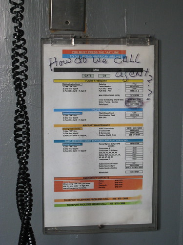
As I was walking down the jetway about to board an American Airlines flight from MIA to LGA, I noticed this sign mounted next to an employee phone. It’s amazing to me when people write questions on signs as though someone is going to answer them. Do they come back later to check? Well in this case, someone did answer it — by circling the extension in question.
This is a classic example of lack of visual hierarchy preventing the “user” from finding the information they need. It’s not hard to conceive that the most common number a flight attendant would need to call from the jetway is the gate attendant. And yet there is no prominence given to this number. Instead someone just circled it to draw focus to it.
The complexity of these dialing instructions is staggering, but the difficulty of the system is exacerbated by the poor design of the sign. American Airlines should be embarrassed by how they deliver crucial information to their employees.
Related Posts:
- Photo of the day: Bottom loading instructions May 7, 2009 | 7 comments
- Photo of the day: A 90-year-old’s cell phone May 4, 2009 | 11 comments
- Photo of the day: Back in 30 minutes June 15, 2010 | 2 comments
- Photo of the day: Brick wall behind glass March 10, 2009 | 5 comments
- Photo of the day: Keep dog’s away February 22, 2009 | 6 comments


Love this article! Great observation skills, Whitney!