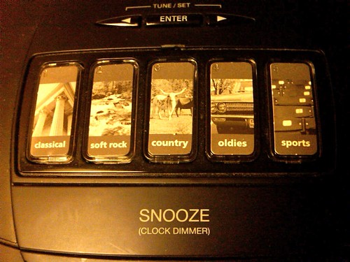
Hotel alarm clocks are usually a big pain in the butt. Hampton Inn aims to fix all that — and takes simplicity to inconceivable levels.
They go so far past easy to use and intuitive that they come back around to obscure and pointless.
They visualize musical genres.
Columns for Classical
Stream for Soft Rock
Cows for Country
Cadillac for Oldies
Bleachers for Sports
Now you tell me: if a hotel guest has somehow never heard of these genres, will they be able to deduce their sound via the associated imagery? My guess is not likely. If you can’t read English, I can see how the bleachers and the cows might point you in the right direction…but a stream for Soft Rock?! First of all, a stream doesn’t make rocks soft, it makes them smooth. Second of all, just because “rock” is a homonym in English (meaning both a mineral and a category of music) doesn’t mean it’s a homonym in any other language — so it could easily be mistaken for sounds of water.
What I’m getting at is why would they ever spend the money on this? They had to produce or purchase the photography. They had to custom design and manufacture the devices. What in their minds could possibly be the benefit of all of this cost and effort?
Hampton Inn is so proud of their radios, they even have them for sale on their Home Collection website for a mere 60 bucks.
If any of you have a different perspective on this, I’d love to hear it. I’m simply stumped.
Related Posts:
- Photo of the day: Do Not Disturb January 25, 2010 | 3 comments
- Photo of the day: Cigarette vending machine May 12, 2009 | 11 comments
- Photo of the day: Back in 30 minutes June 15, 2010 | 2 comments
- The conditioner bottles at The Hampton Inn March 29, 2009 | 7 comments
- Photo of the day: A man in need of an iPad June 11, 2010 | 3 comments


Yep, completely inappropriate metaphors. How about a violin for classical, a football for sports, an electric guitar for rock?
I absolutely love the idea, but the pictures miss the mark. I wonder if the pictures are even necessary. Are musical genres the same across cultures? I know most countries have “rock” but does “oldies” mean 60s-70s to those outside the US?
I see that “rock” isn’t even a button. Surely, that’s an oversight too! Which button do you push to listen to Green Day?
If I come across a device (especially a noisy one like a radio) that’s labeled in an unfamiliar language, I’m usually a bit too scared to just press buttons randomly to “see what they do”.
While I agree that the images on the buttons leave a lot of room for interpretation of their classification, I wonder if they might also encourage a bit of exploratory behavior on the part of users?
I think I’d be more likely to press the picture button that appealed most to me from this set (I’d press the cow), just to see what it was, and maybe try pressing some of the others too – I wouldn’t be worried that I’d be accidentally turning on the alarm.
Of course, the main goal of hotel guests is probably not finding something nice to listen to, but more likely making sure they don’t miss their flight in the morning! “Super-easy to set”, they say – is it?
I’m a little bit surprised by the negativity on this one. I think they deserve an E for effort and I think the main mistake is that a few of the metaphors could have been better chosen.
“What in their minds could possibly be the benefit of all of this cost and effort?”
Um, maybe they wanted to go the extra mile and create a special experience for the user, something they would remember :-). Since when does an image or icon HAVE to make it something easier to use, often it’s simply a pleasant visual cue. Also, hard to know how much cost and effort this actually added. Could be a piece that is being OEM’d and sold to many different channels for quite cheap.
I guess they are in the right direction. One touch and I get to play some genre of music (instead of fiddling with a scan button)
I agree with Timothy that it allows me to explore. A hotel can have a great variety of guests and hence this model could easily invite anyone to explore (of course people who dont read english are going to have issues).
I would prefer buttons that light up when pressed. And simple words like News, Music, Sports etc., may work without the metaphor.
I can tell you from personal experience that those idiotic buttons are absolutely no use when trying to find the local NPR station…
Don’t they also use a similar style of images in their elevators, and on various bits of decor? If so, it would seem to be more of an extension of that branding/design/general aesthetic than a move towards improved UX. The style of photography, solid blocks framing, and the font is definitely in line with what I remember throughout the rest of the hotel.
Found a random example via Google image search: http://media-cdn.tripadvisor.com/media/photo-s/01/4a/be/20/07-elevator-decoration.jpg