I don’t want to beat a dead horse here. We all know that Tropicana redesigned their cartons and there was a major backlash from consumers.
In the end it was pulled from the shelves, but not before Matt Knell was able to snap this unbelievable pic:
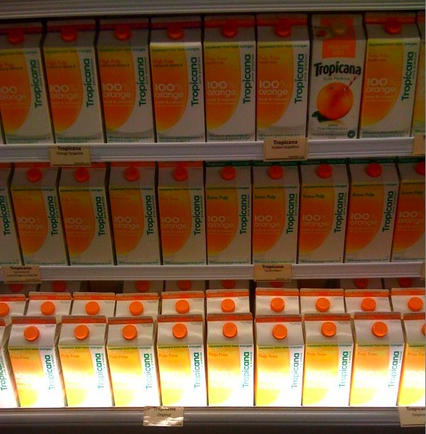
Matt showed me this photo on his iPhone recently and said, “Tell me how many different cartons are in this grocery display?”
“Two,” I said confidently. “Three shelves of the new design and one lowly carton of the old design.”
“Nope. There are FIVE.”
What?! I couldn’t see it. Then Matt pointed out each of the distinct variations, which are indicated only by the color of stripe at the top of the carton above the pouring spout.
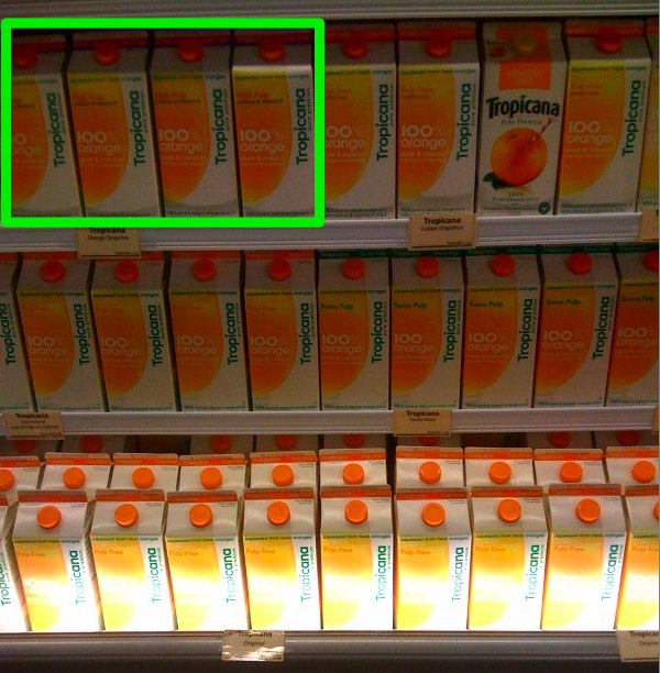
High Pulp orange juice with calcium and vitamin D (marked with a magenta stripe and blue line):
Pulp Free orange juice for Healthy Kids (marked with an orange stripe and orange line):
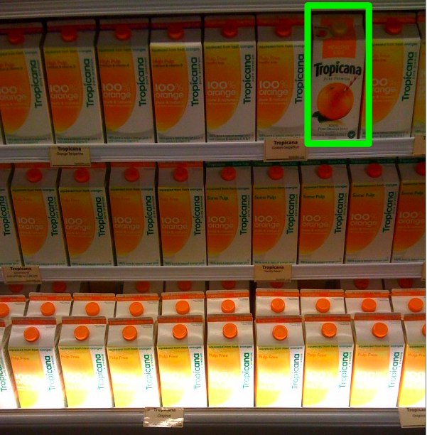
One lone carton of Pulp Free orange juice for Healthy Kids in the old design:
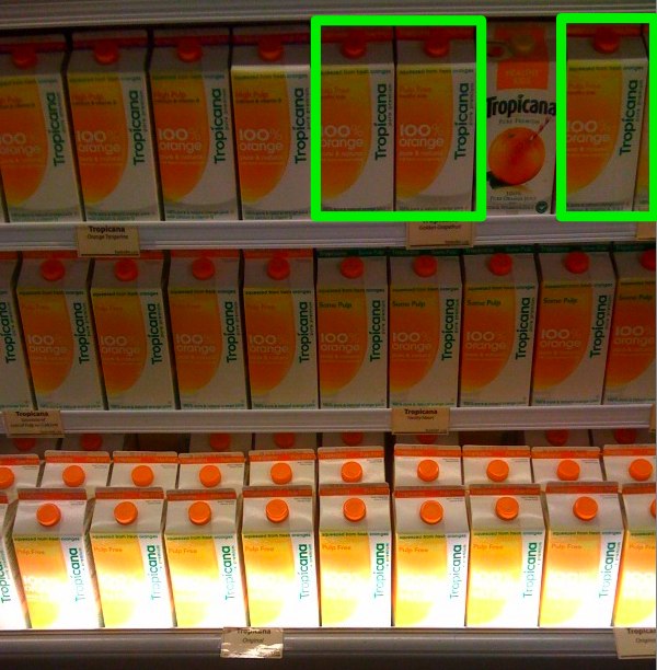
Pulp Free orange juice (marked with just an orange stripe):
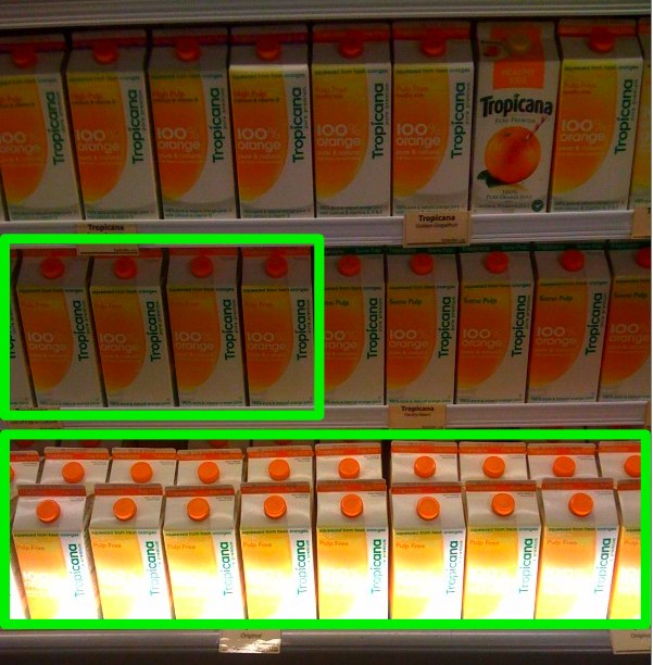
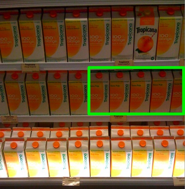
Some Pulp orange juice (marked with a green stripe):
I was amazed at how subtle the differences were. Hardly any clear cues to a customer who’s trying to get in and out of the grocery store as quickly as possible. Ultimately the carton redesigns severely hurt Tropicana’s brand recognition and led to diminished sales. Hopefully the lesson learned here is to stay true to timeless symbols — particularly with mass market products that already have such dominant market share.
Some great analysis on the Tropicana redesign:
Eight Major Failures by Matt Everson
Packaging: Lessons from Tropicana’s Fruitless Design by Jennifer Gidman
Related Posts:
- Photo of the day: Back in 30 minutes June 15, 2010 | 2 comments
- Photo of the day: Unattended Kids April 2, 2009 | 1 comments
- Photo of the day: Time To Buy Cut-Rite July 8, 2009 | 1 comments
- Photo of the day: Follow this line January 11, 2011 | 7 comments
- Photo of the day: Brick wall behind glass March 10, 2009 | 5 comments

Yep, big design fail. I snapped a similar photo on my blog. But the lone, orphaned package design in this photo is priceless!
What was even more interesting to me were the non-OJ packages. The original cartons showed images of whatever kind of fruit was used, including mixed fruit drinks like strawberry-peach-banana-whatever. The new design only showed the color of the liquid (which was always somewhere between yellow-orange-pink) and text to describe the contents.
It's funny you mention this because I spent 20 minutes looking at the bottom
row of that Tropicana display trying to figure out if it was indeed OJ (the
flash made it hard to tell). There was a sign noting grapefruit juice on the
second row, but after close inspection there are no grapefruit juice
cartoons in the pic. I was kind of hoping there were so I could point out
exactly what you're talking about. There are also varieties of OJ mixed with
other juices, like Tangerine, and the astonishing thing is that they're
still marked as “100% Orange” with text beneath that says “and Tangerine” —
that math does not add up!
<img src=”
http://2.bp.blogspot.com/_TerE87hZIzk/SWPT-OHAs…
20/100_7340.jpg” class=”center”>
At least the customers “won” when PepsiCo pulled the package. Good UX applies to everything.